When a small local sushi restaurant had yet another competitor opening in the vicinity in an already saturated sushi restaurant market in the small city of Port Moody, it knew it needed to stand out. Dining was becoming trendy with social media, and COVID changed everything to digital. Murasaki Japanese Restaurant needed to have a unified and modern look to appeal to its core customer group: families.
To stand out with its authentic voice that will stand the test of time in this fast-changing time, the brand voice must capture the spirit and character of the restaurant: friendliness and natural beauty. These qualities must be expressed to gain trust and customers.
Staying away from the stereotypical modern West Coast Japanese restaurants and finding its character from the history and people of the place. Make it easy and clean to read for all age groups, which is necessary for a menu serving well over 100 items. Make the interface clean and simple, suitable to apply to the digital world. Show Murasaki’s friendly and personable attitude, as it is their unbeatable strength.
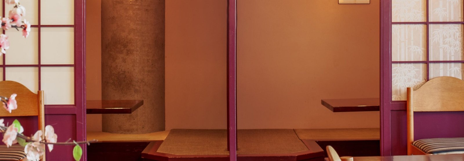
Express the business as a hub for family and friends gathering in the local area with an ambiance of easy-going, comfortable and warm. Create aesthetics that spring from comfort and peace to translate the philosophy behind Japanese cuisine.
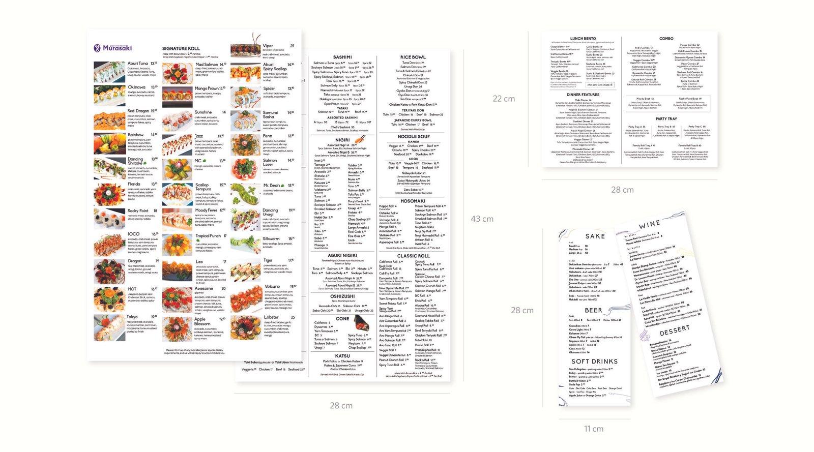
The change in menu design was a priority as it would provide the most effective updated impression on the customer’s experience with the restaurant’s new approach.
Previously, a +10-page long and hard-to-read menu bound in a book style was transformed into a one large, double-sided and waterproof menu without a cover. The purpose of the format change was to deliver a large amount of information as fast as possible in the most clear and simple manner. Only the pictures of the special rolls were kept to aid the choosing. The inspiration was a simple old diner menus that were handed out in a greasy environment. West coast style sushi is greasy with a lot of deep-fried food and there are many families with young kids. To avoid frequent need to change the menus, the texture of the paper were chosen to be oil and stain resistant.
Other complementary menus of displaying drinks and combo items & Lunch-dinner specials were separately designed to accompany the main menu to be presented as a set.
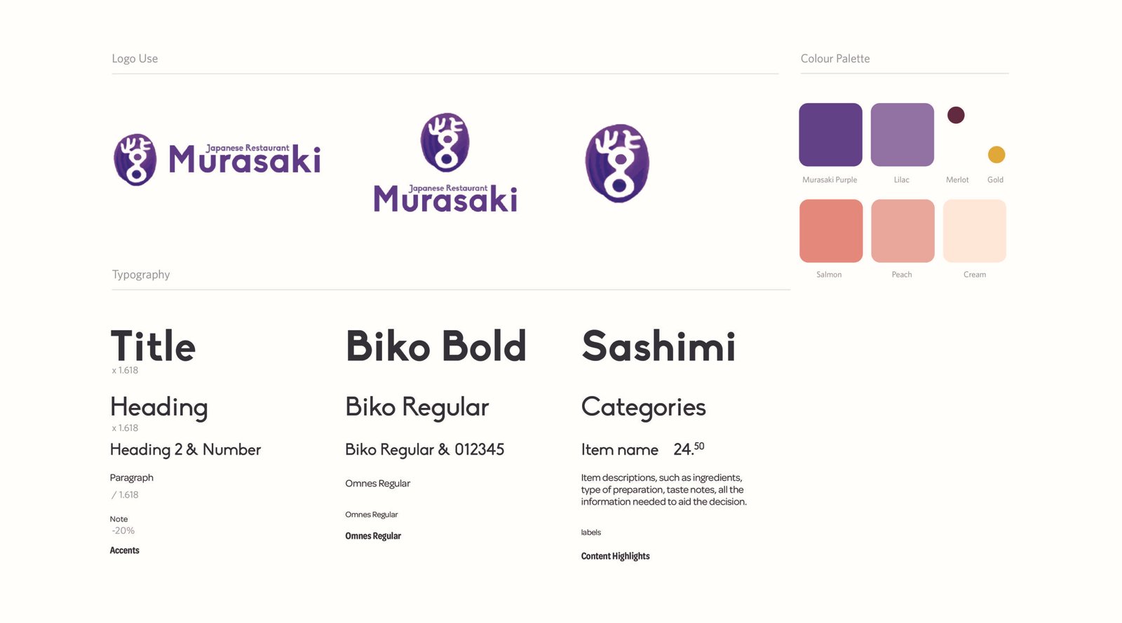
To create a sense of branded aesthetics around the existing logo, a friendly, humanistic Typography was chosen to communicate to modern, easy-going families that express the friendliness of the restaurant. These fonts would work well in digital format as well.
Next, a set of colours was chosen to ensure the consistent expression of emotional values: nature, comfort, warmth, and delicious! The restaurant’s name, meaning purple, had to be taken into consideration. Friendly, light-hearted, premium, and warm were desired emotions to be associated when choosing the shades of purples. Warm and peaceful feelings were then translated into the colors of Salmon, peach and cream that were also suitable to accompany the chosen range of purple. All together, the palette would speak a soft and cozy and welcoming atmosphere of a family-friendly restaurant. (After all, choosing a Salmon color for a sushi restaurant is a no-brainer.)
The accent colors were picked from the interior design of the restaurant which has a bit more heavier tonal values: merlot (dark cherry) and gold These would be used to tie everything together for people who would step in to dine in at the restaurant.
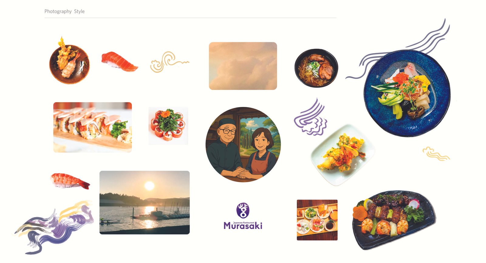
Use of photos is another important aspect in creating successful brand aesthetics; the photos appear on the menu, website, social media, and most importantly, they could make or break the sales of the dishes!
Simple, naturally-lit photos that speaks freshness, familiarity and easy-going attitude express how simple it is to order and enjoy Japanese food. The restaurant’s price range is low to medium, so the style avoided looking too fancy or austere that could deter people who wish to dine casually. The photos of nature and abstract style of natural elements associate the natural beauty of the place to nature. The city where the restaurant is located is known for its pristine beauty in the sea and mountain, so it is adding a sense of freshness and peaceful beauty to its offering, borrowed from the images of nature.
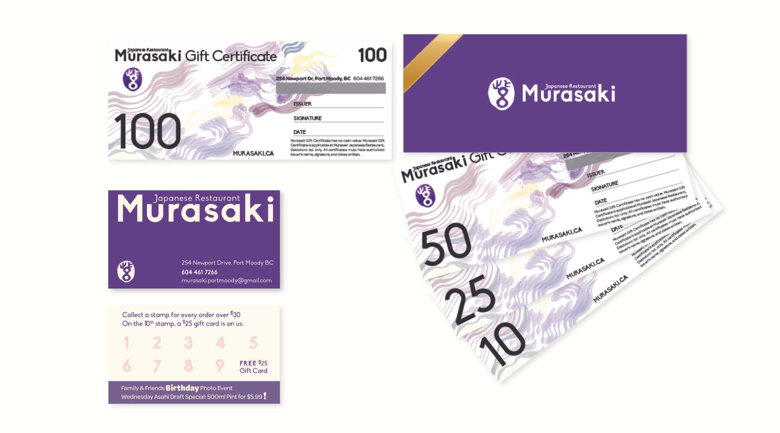
With the established brand aesthetics, a set of gift cards and business cards was designed to complement the menu, photo and graphics style. Friendly and playful purple and lilac colours were combined with symbolic illustration of nature– wave, wind and flow. The mysterious representation of the marketing material was intended to exude a sense of premium service and an object of luxury and fine things. This was especially the focal point when designing a gift card as the act of gifting and receiving should feel elevated and elegant!
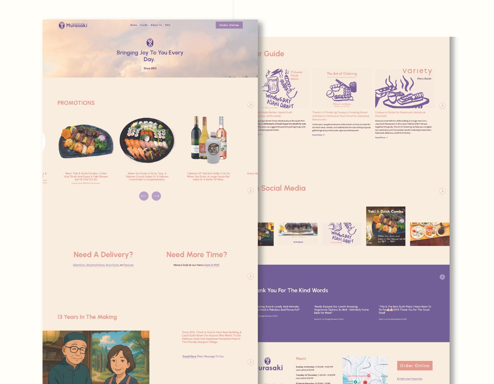
With the consistent use of brand aesthetics, messages, and information about Murasaki went to its website. Using Squarespace, a simple multi-page website was built with a display of menu & promotions, and links to online ordering and delivery services.
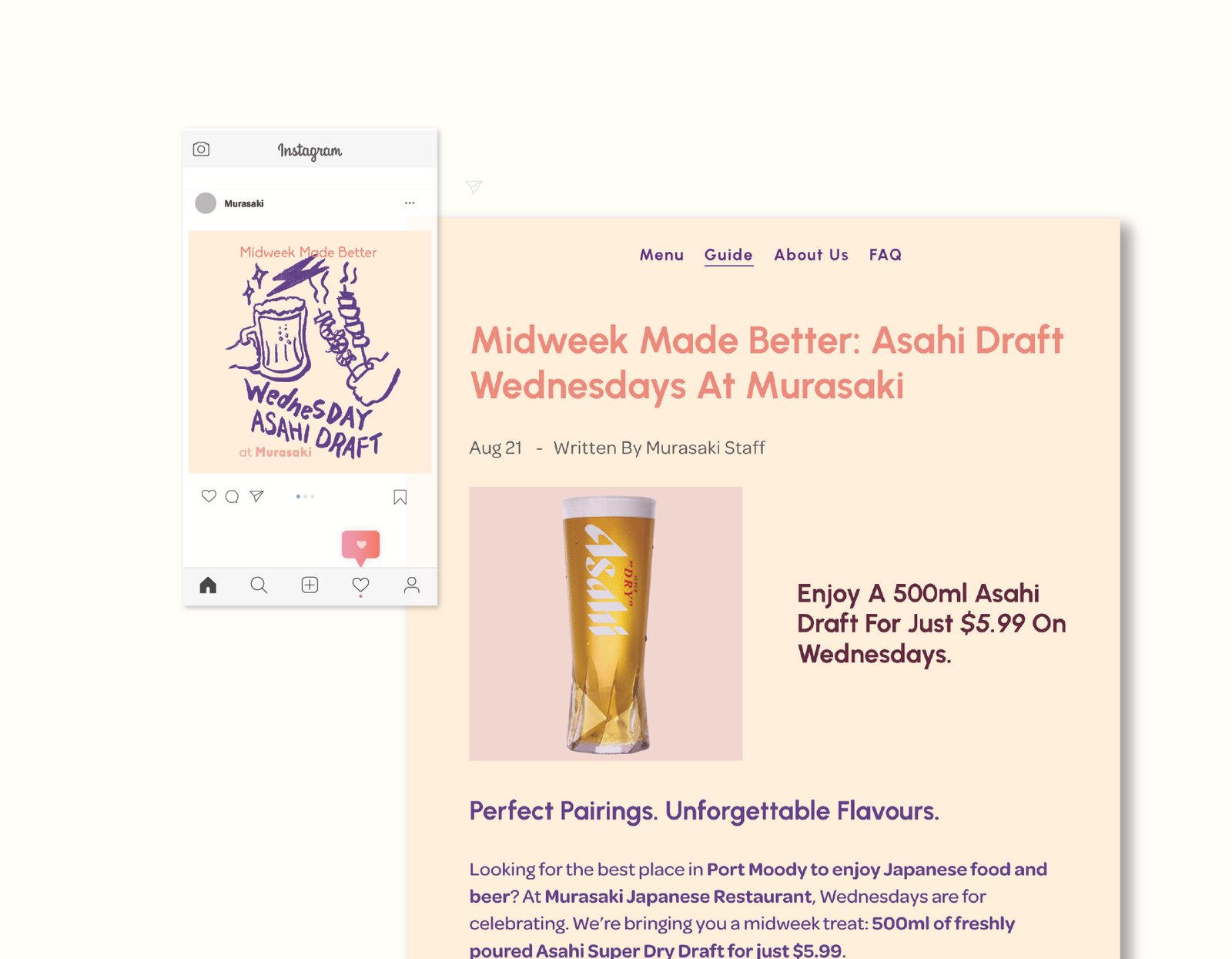
Blog posts that introduce and market the restaurant’s products and services also followed the brand aesthetics and were written in a voice of friendly, warm and informative manner. Social media posts were designed with illustrations in a cartoon style to invite viewers for a fun and informative read.
The restaurant received many compliments for the updated menu design! The general atmosphere of the restaurant received a big boost and a sense of elevation. Across all channels of contact, whether it is with dining customers to website visitors, the restaurant, Murasaki, had its place separate from a typical sushi restaurant that you could find anywhere in Greater Vancouver.
Some insights I had
• Consistency is the key to creating a unified sense of branding.
• Through many trials and errors, the right elements can be mined from the infinite possibilities of visual languages.
• When using the right colours, tones of voice, typography and graphic styles, it can empower much and the opposite is also true. And in doing so, authenticity is mandatory.
• Trend does not develop a character; choosing to be who you are does.

