Murasaki Japanese Restaurant branding and graphic design work is showcased.

Revamping Brand Identity and designing marketing materials for Murasaki Japanese Restaurant

Murasaki Japanese Restaurant is a local, family-run establishment in Port Moody, BC, Canada, with 13 years of experience. Inspired by the serene and pristine nature of Port Moody, the restaurant has revamped its menu, website, and other marketing materials to better serve and appeal to the local community, which is primarily suburban and family-oriented.

Brand Identity Design

Murasaki Japanese restaurant's branding is revamped to reflect the warm and friendly attitude of the service coupled with modern upgrade.

An Initiative to Adapt

Murasaki’s brand identity was redefined to best represent the business. Joy, friendly attitude and warmth combined with the adaptation for the new stylistic call for clean and digital presence, Murasaki’s brand identity was re-established to best represent the business. 

Colors and typography for Murasaki Japanese Restaurant's branding represent the friendly and warm attitude and the modern adaptation of the business operating over a decade.

Brand Identifiers

To cater to Murasaki’s approach to adapt to the digital world and modern design, San serif typography, Biko and Omnes, were chosen to accompany the soft pastel tones of salmon and purple colours. 

To showcase our photos, Murasaki Japanese Restaurant uses photos taken in natural light and with a simple background made of natural elements like marbles, wood, and slabs.

Photo Style

Food Photos were taken in natural light with a bright background. Post-modified food photos were placed against simple and natural element backgrounds like marble and wood to align with Murasaki’s approach of being natural and showcasing the food in their natural elements with imperfection.  

Design for Marketing Materials

Murasaki's drink menu is presented with a minimal design with natural elements in illustration.

Menu Design

Murasaki’s brand identity was redefined to best represent the business. Joy, friendly attitude and warmth combined with the adaptation for the new stylistic call for clean and digital presence, Murasaki’s brand identity was re-established to best represent the business. 

It is the back of the gift card from Murasaki Japanese Restaurant.
Murasaki Gift Card is designed with natural elements like water and wind.

Marketing Materials

Gift certificates and loyalty cards were designed to complement the natural and clean aesthetic of the new branding.  

To showcase our photos, Murasaki Japanese Restaurant uses photos taken in natural light and with a simple background made of natural elements like marbles, wood, and slabs.

Photo Style

Food Photos were taken in natural light with a bright background. Post-modified food photos were placed against simple and natural element backgrounds like marble and wood to align with Murasaki’s approach of being natural and showcasing the food in their natural elements with imperfection.  

logo, colors, type, and imagery determine the new branding for Murasaki Japanese Restaurant.

Brand Identity System

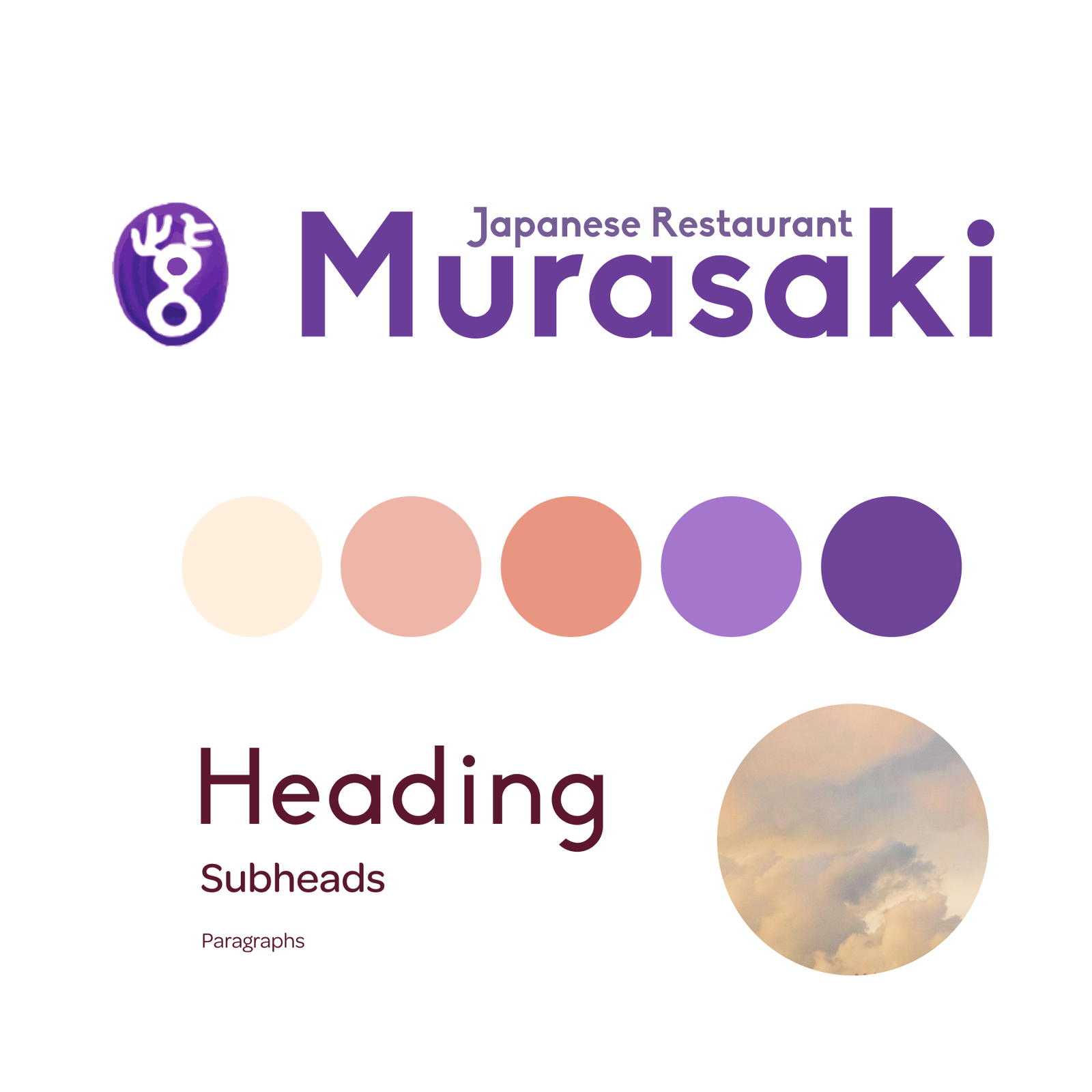
Warm, welcoming, and modern style that is suitable for simplistic Japanese aesthetics are the feelings behind each brand elements.

Website Design & Blog

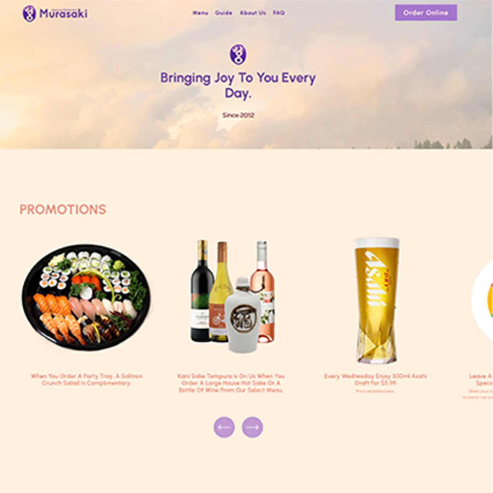
To align with the digital and information age, the restaurant's website is redesigned to be simple and easy to use, featuring CTAs for online orders.

Murasaki Japanese reestaurant's dine in menu was redesigned to effectively showcase the business' big and diverse menu choices.

Menu & Marketing materials

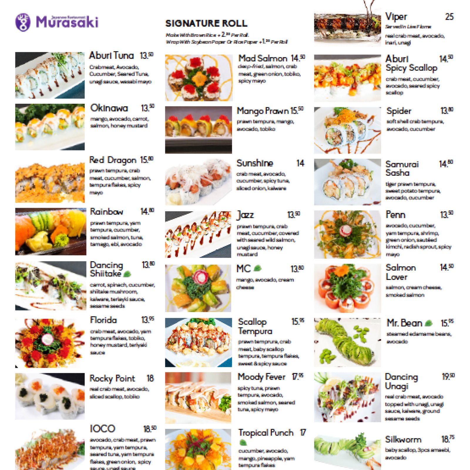
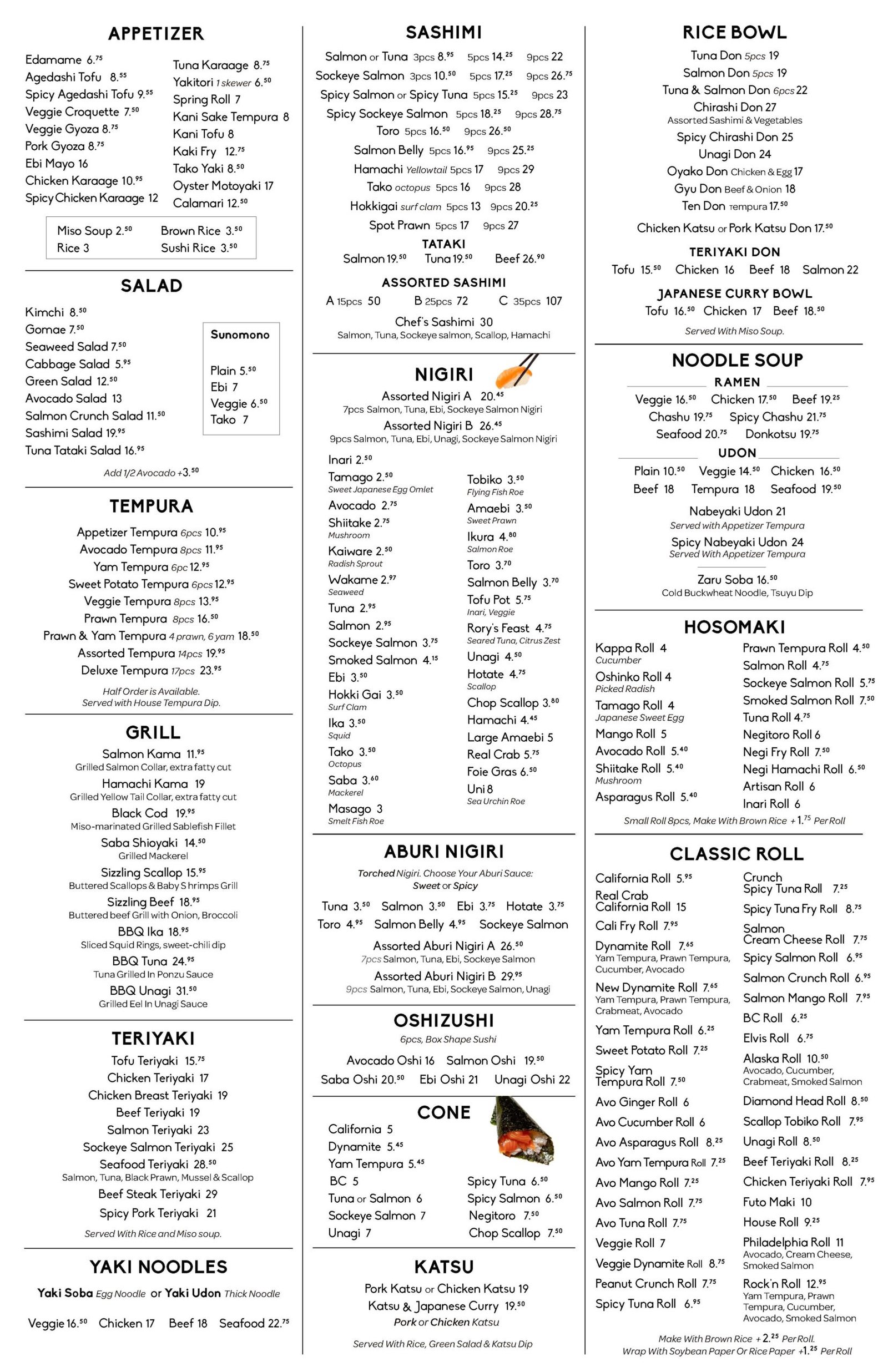
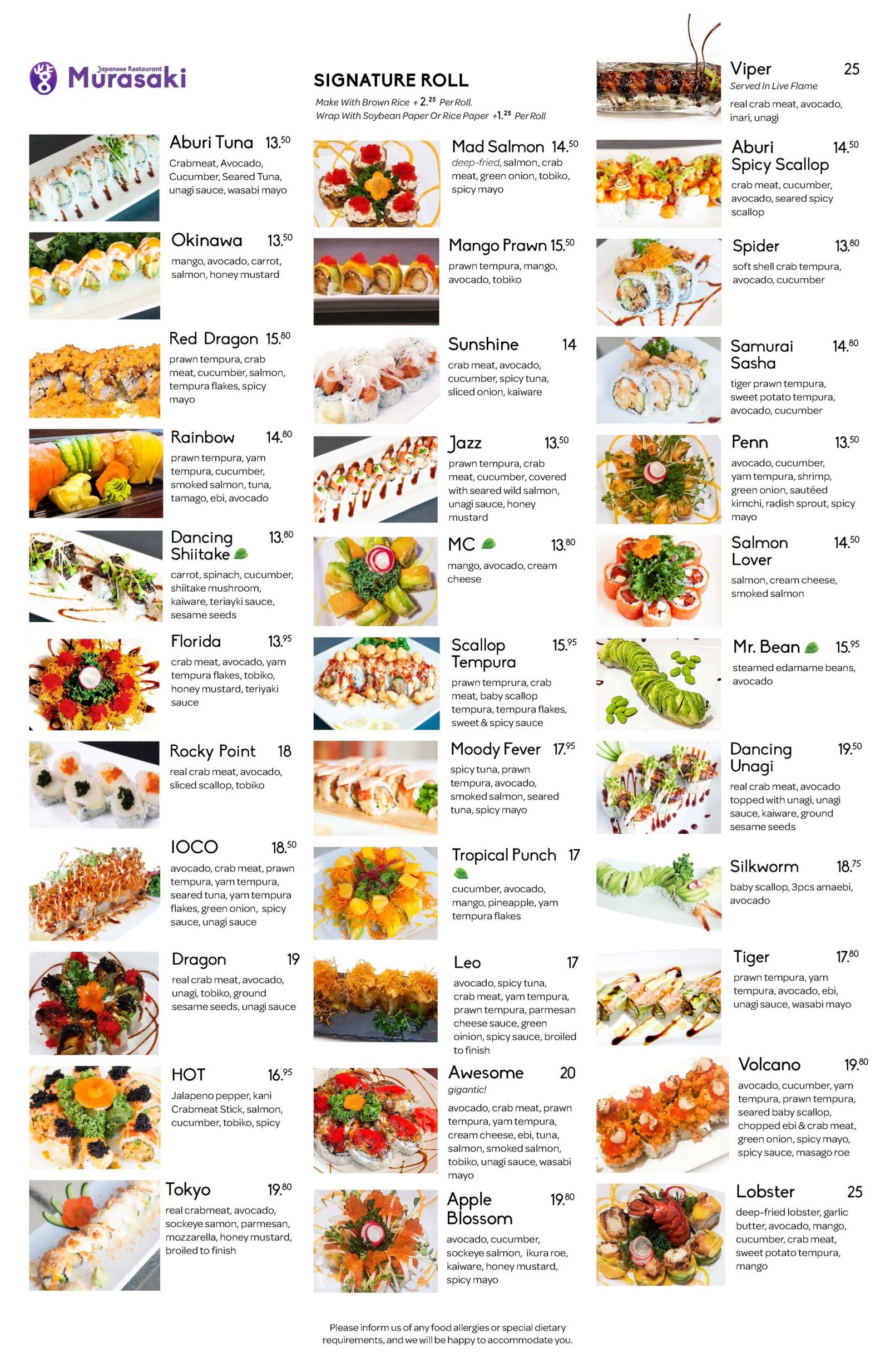
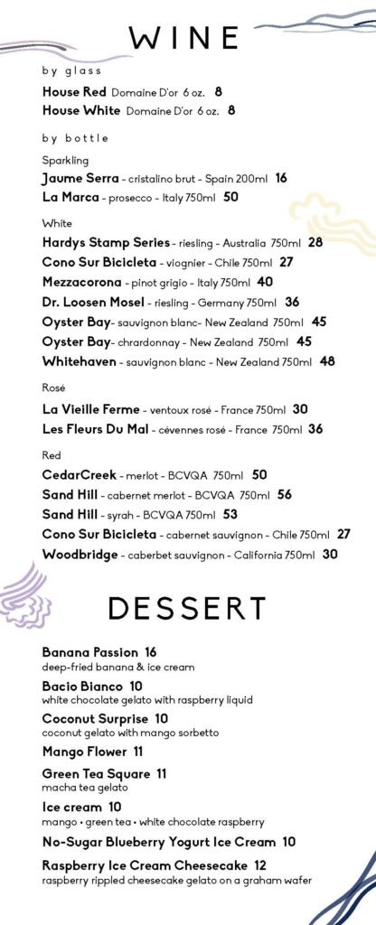
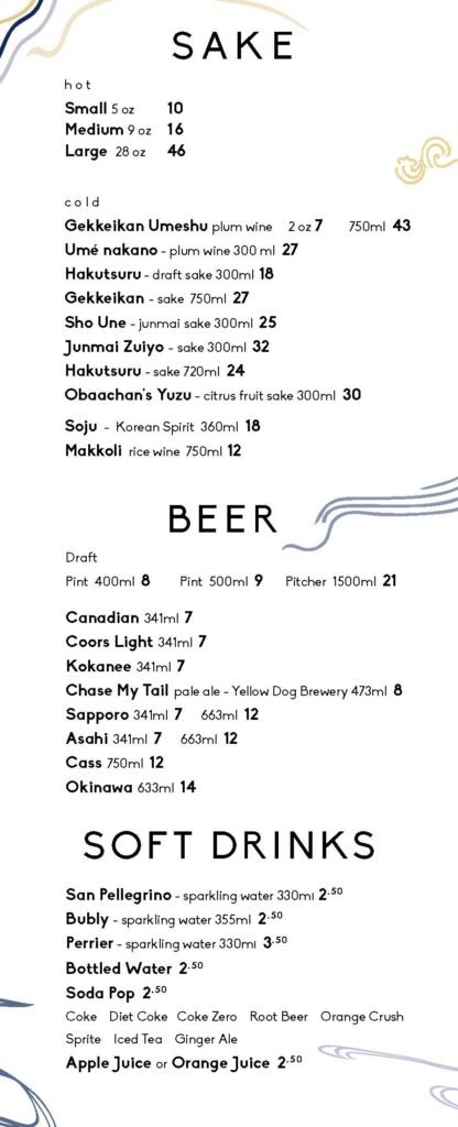
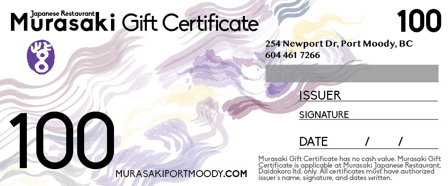
To enhance service for long-term customers and newcomers, the restaurant updated its menu and marketing materials to align with the new brand identity.

Besides the redesign of the branding elements, website, and menus, a blog and social media posts were added, along with photography of the dishes, to enrich and incorporate cohesive branding.  Visit Murasaki Japanese Restaurant’s website here.