Illustrative Packaging Design for beauty soap

soap Box Packaging design for a beauty brand i wish existed

Beauty
Bohème
Mock Project 

Art direction, branding, Packaging design

four soap box packaging design for a mock brand, boheme to showcase branding design idea with artwork by studio hyejunahn.

Question: How to create an immersive experience of nature's beauty with packaging?

 Vintage style illustrations of the classic  Crabtree & Evelyn product packaging and the labelling aesthetics of the natural ingredients-focused Manufaktura (in Prague) inspire me a lot.  Since beauty products are loaded with sensory and imaginative information derived from nature, I thought using artwork with maximal style to design would best communicate the benefits of the products, linking them with the power of nature.

The following product is the kind of brand I wish existed in the beauty  & body product market, and its packaging reveals the focus and philosophy of the brand, which is to use the power of nature in healing and beautification, every day through a product. 

The brand's name, boheme comes from the inspiration, Bohemianism in the 19th-century Paris.

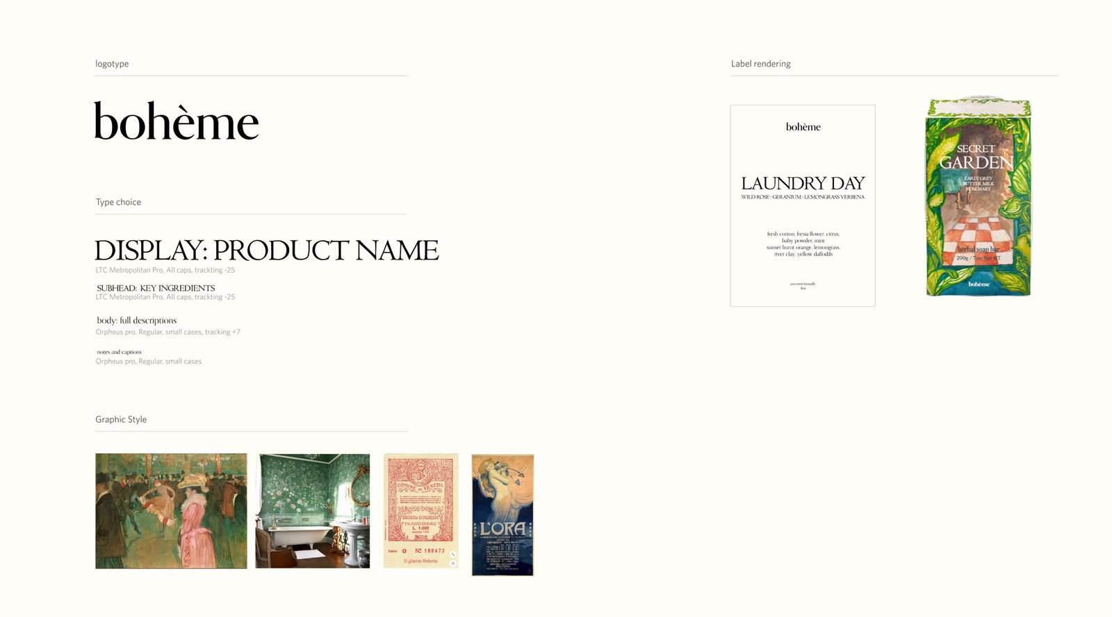
Boheme from the Bohemianism

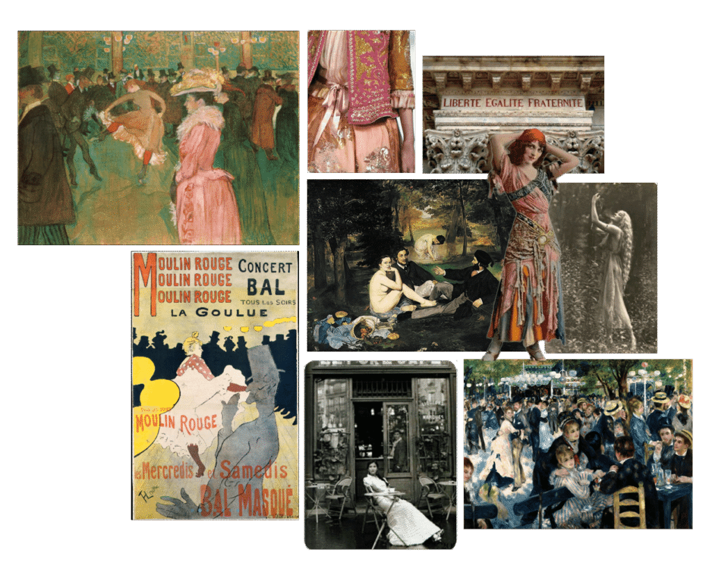
Drawing on my personal experience of feeling rejuvenated and beautified after visiting untouched nature, I created a fictional brand called Bohème. The concept is borrowed from bohemianism, a popular art and culture movement born out of 19th-century Paris. Young and broke artists settled down in the “Bohemian” region of the city, where it was known for low living costs amongst Gypsie community’s settlement. These artists depicted and produced artwork– from painting to writing– using unconventional subjects like Go-Go dancers (Moulin Rouge), cafe cultures, the low profile of society and the like. The desire to break free from the social norm of classism and materialistic lifestyle sought by the middle class of the society at the time crystallized into some of the works we know today, for example, Henri de Toulouse-Lautrec (At the Moulin Rouge), Vincent Van Gogh,  and Eduoard Manet (Le Dejeuner sur l’herbes). 

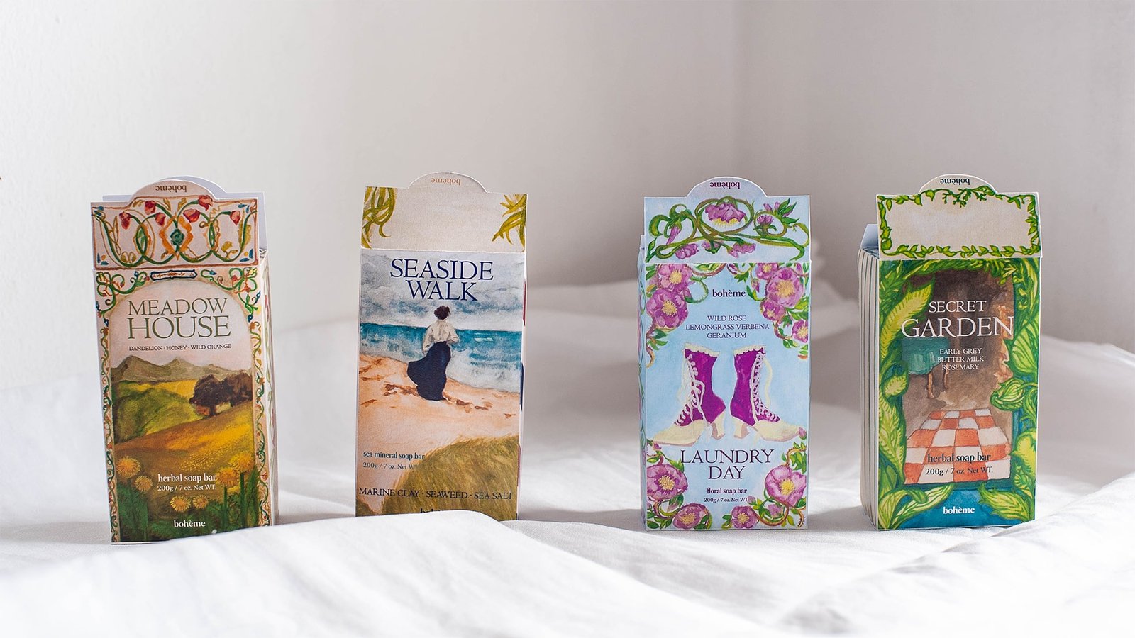
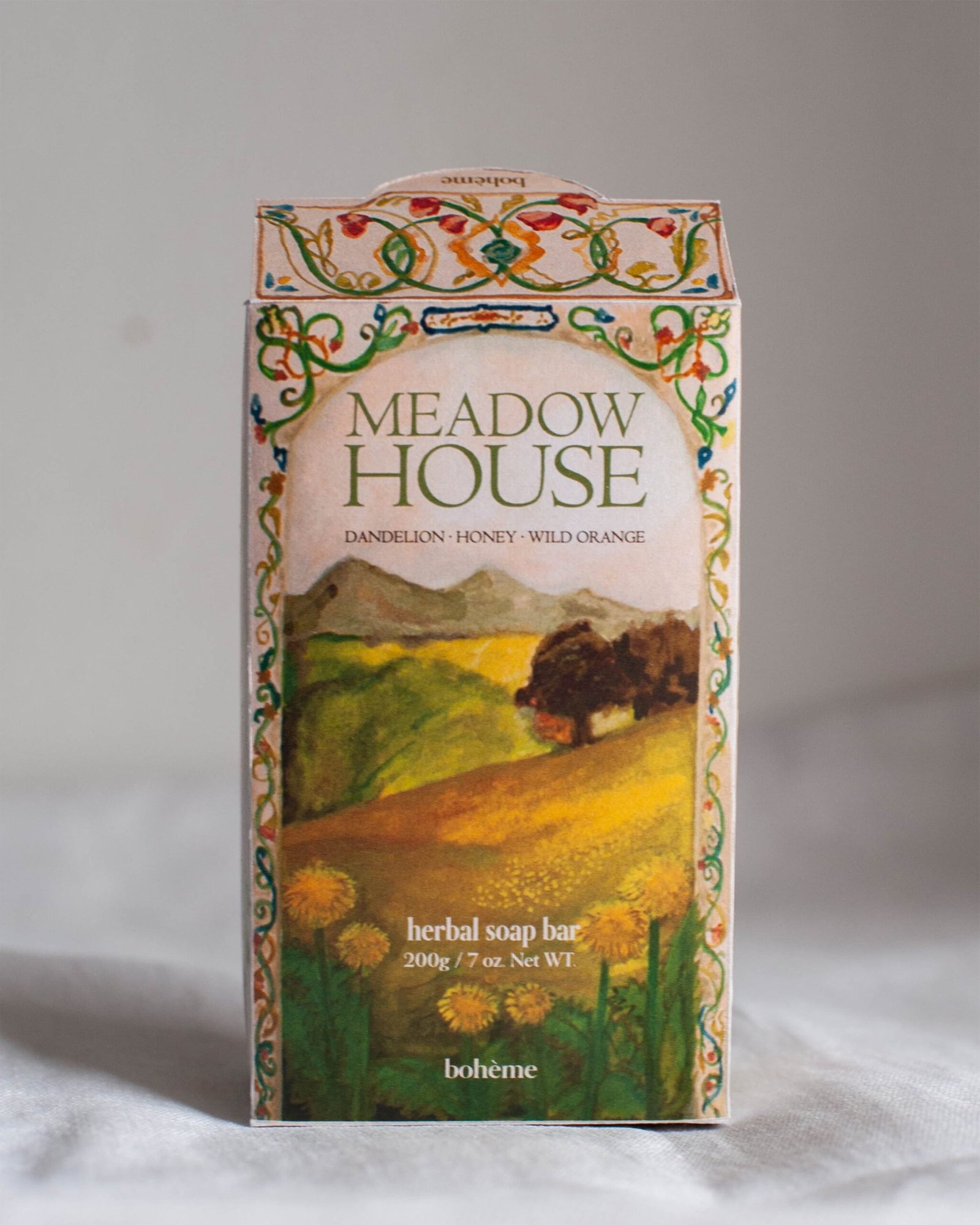
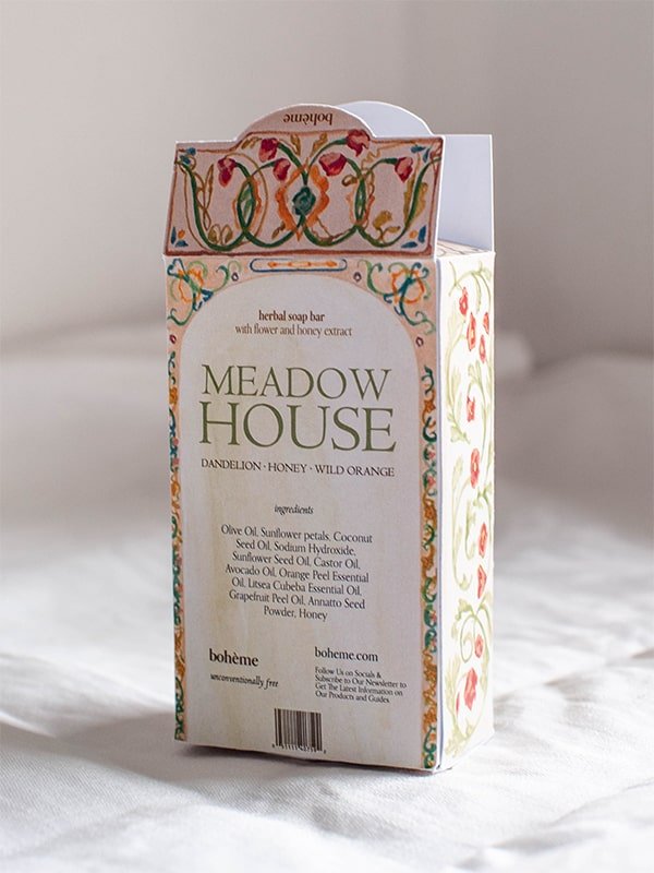
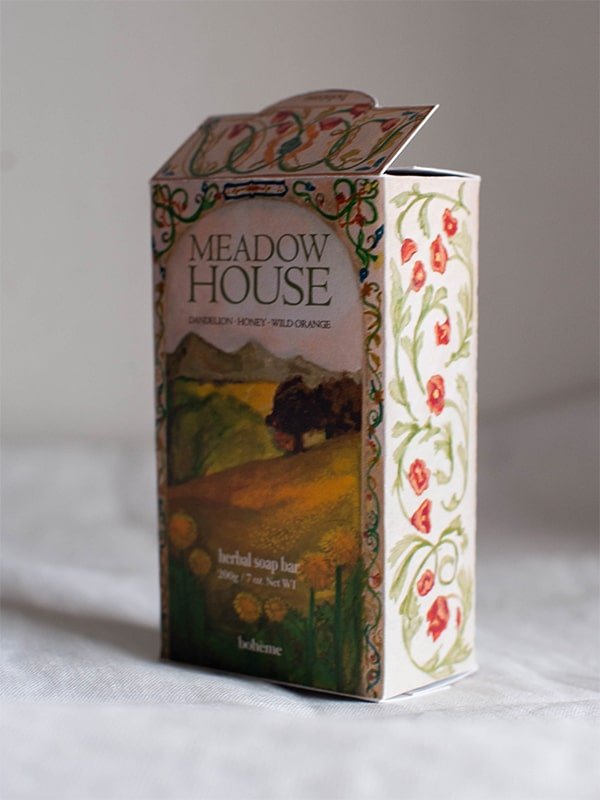
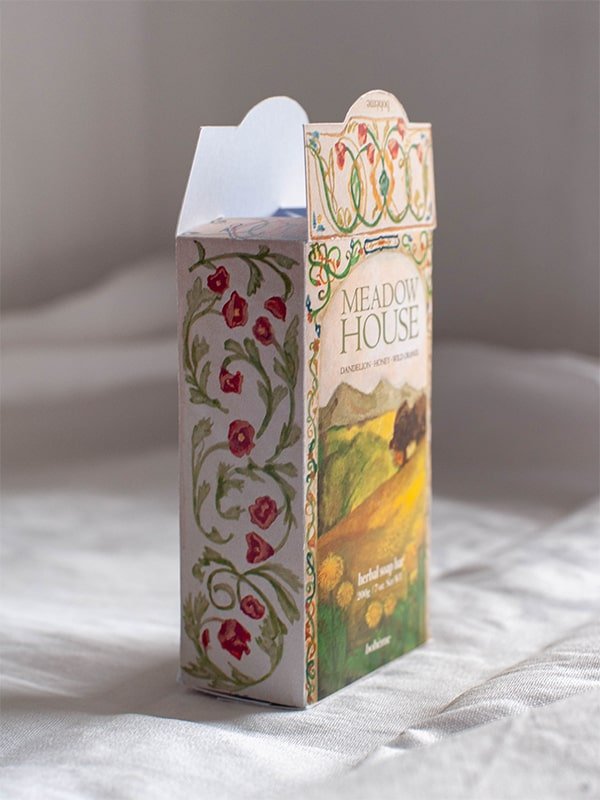
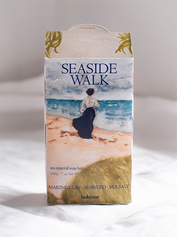
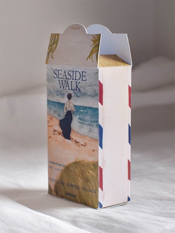
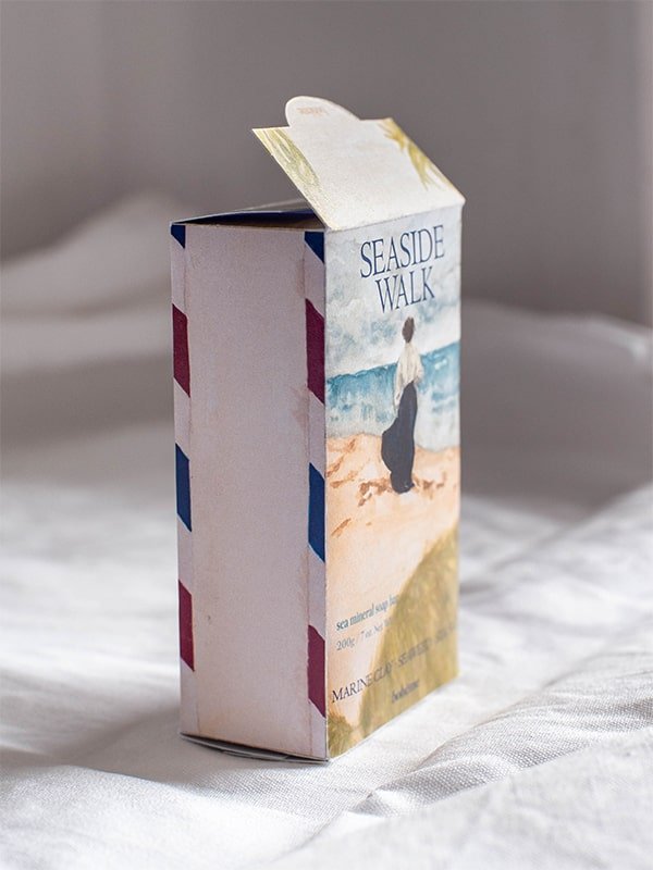
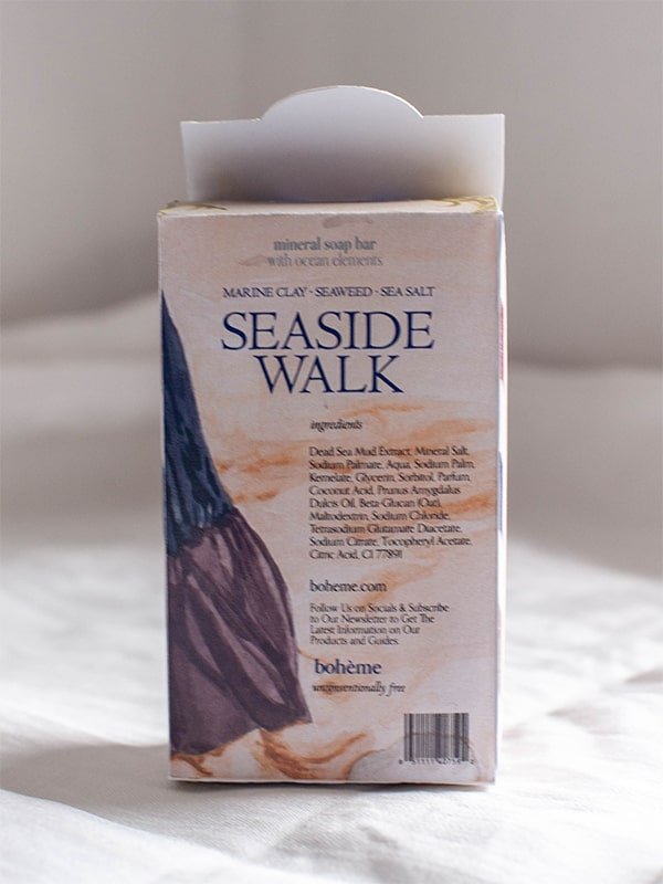
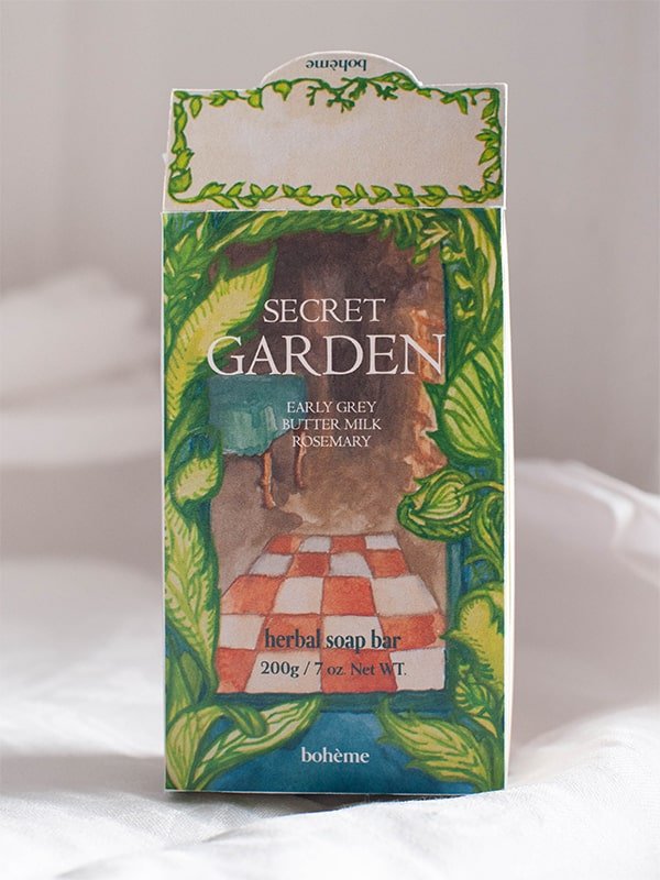
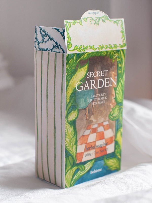
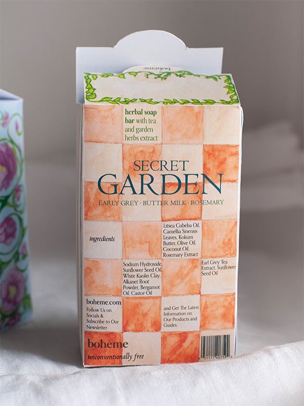
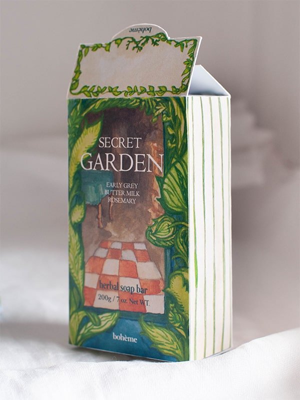
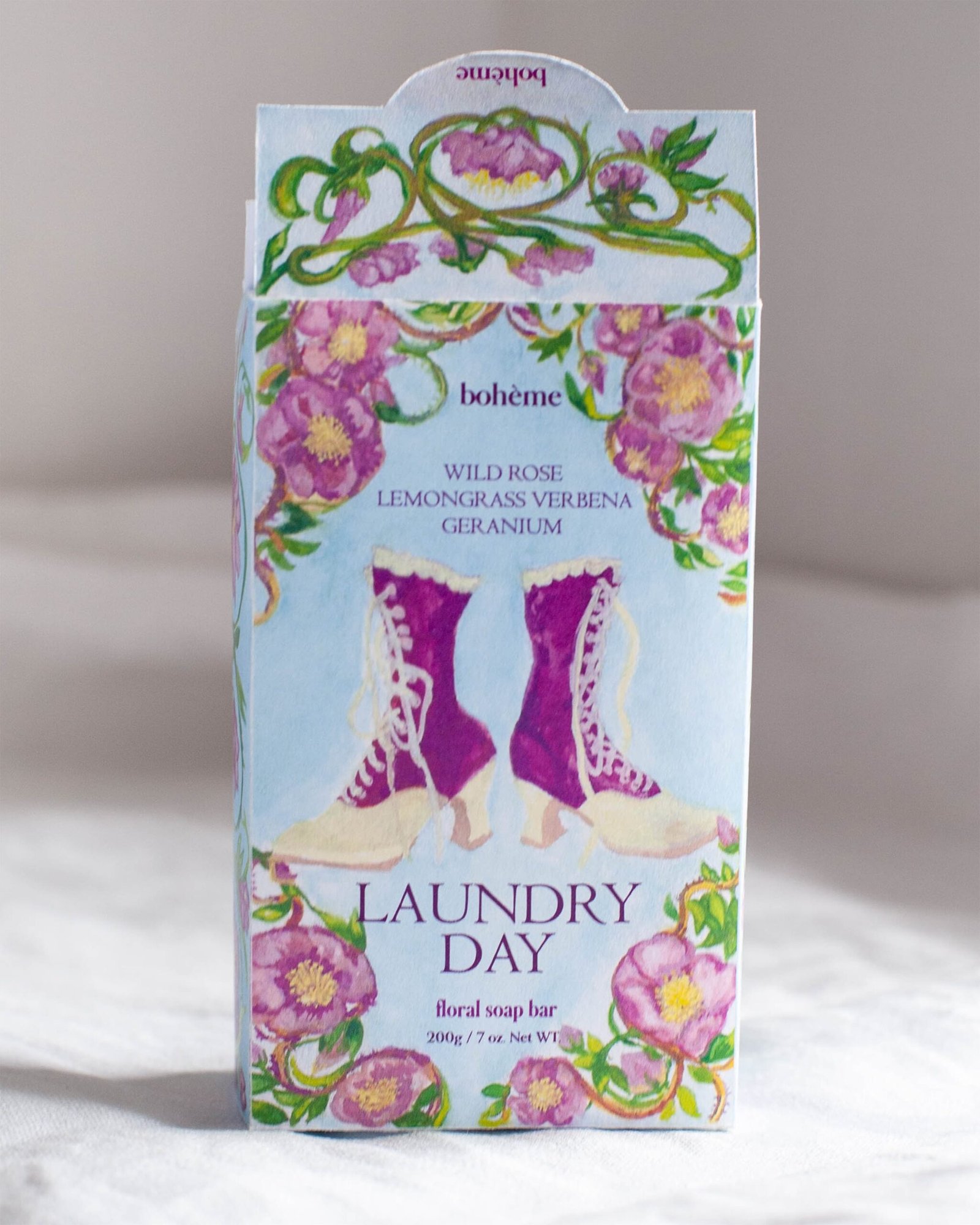
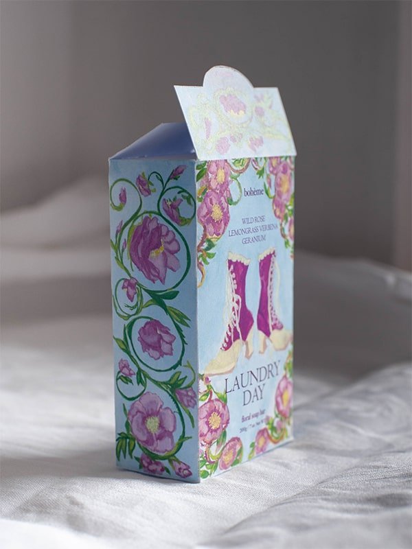
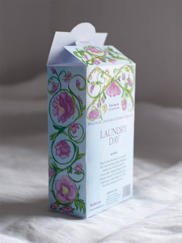
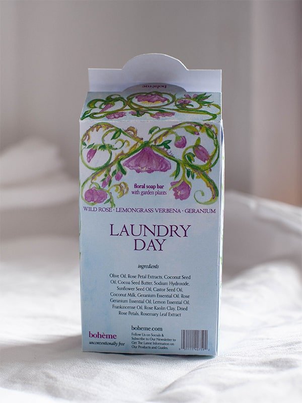
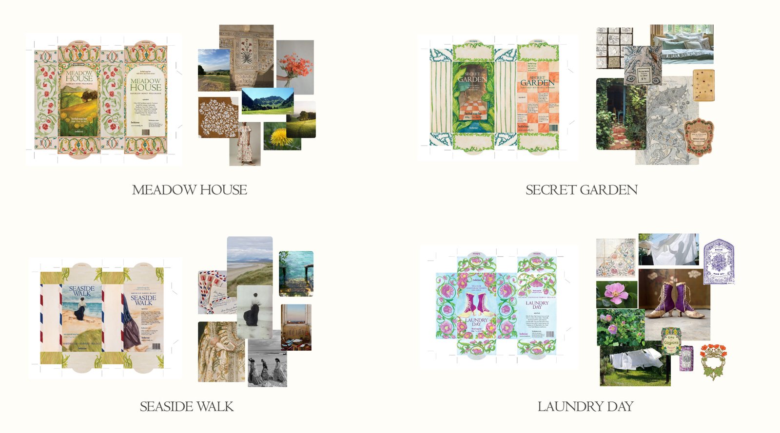
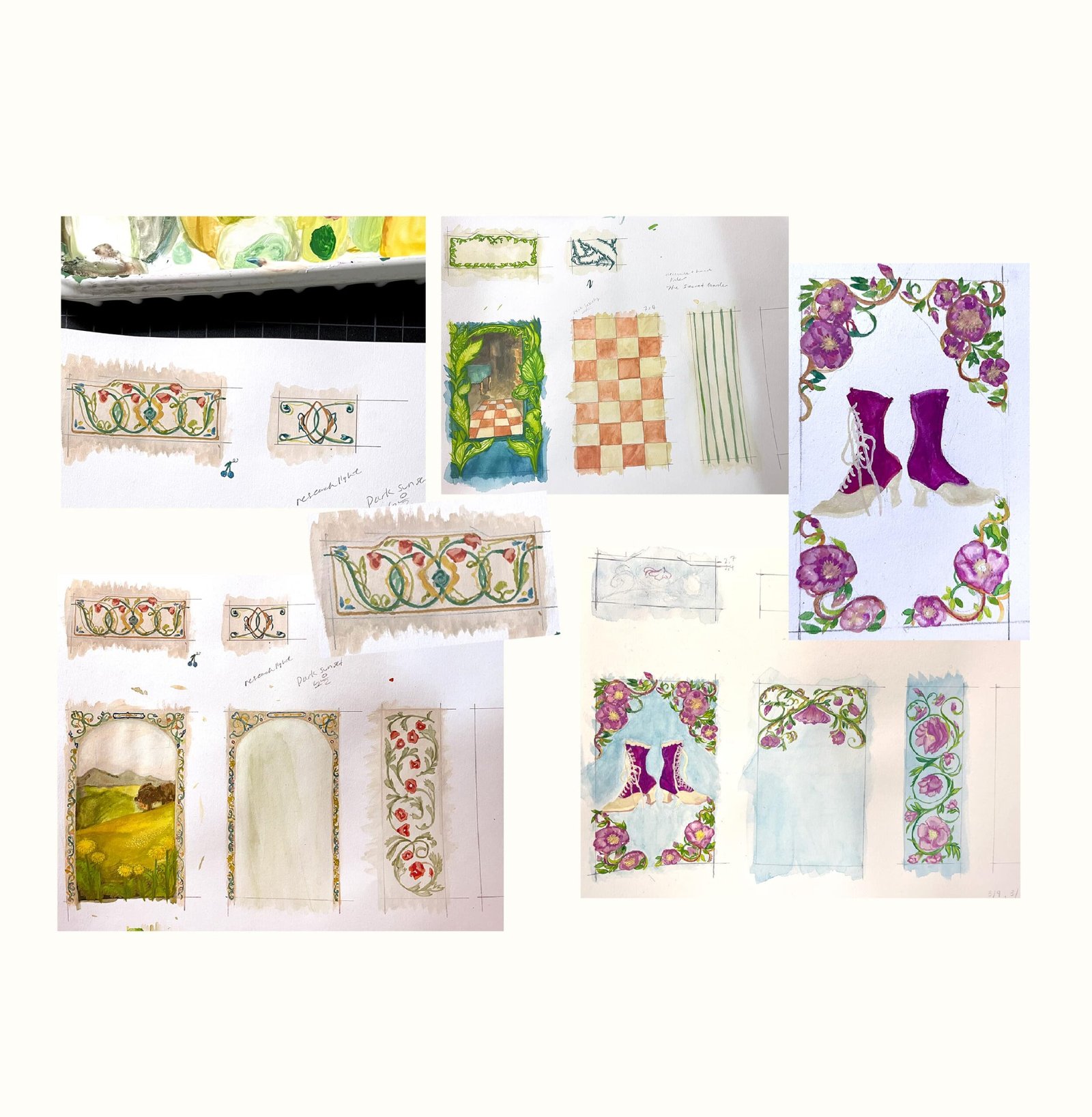
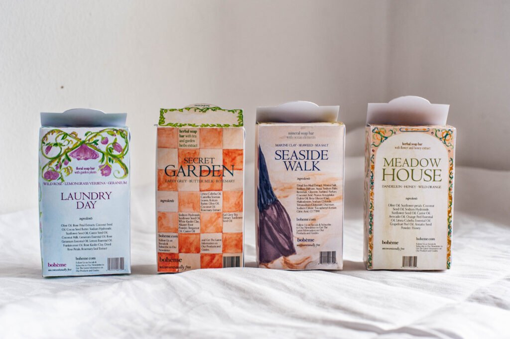
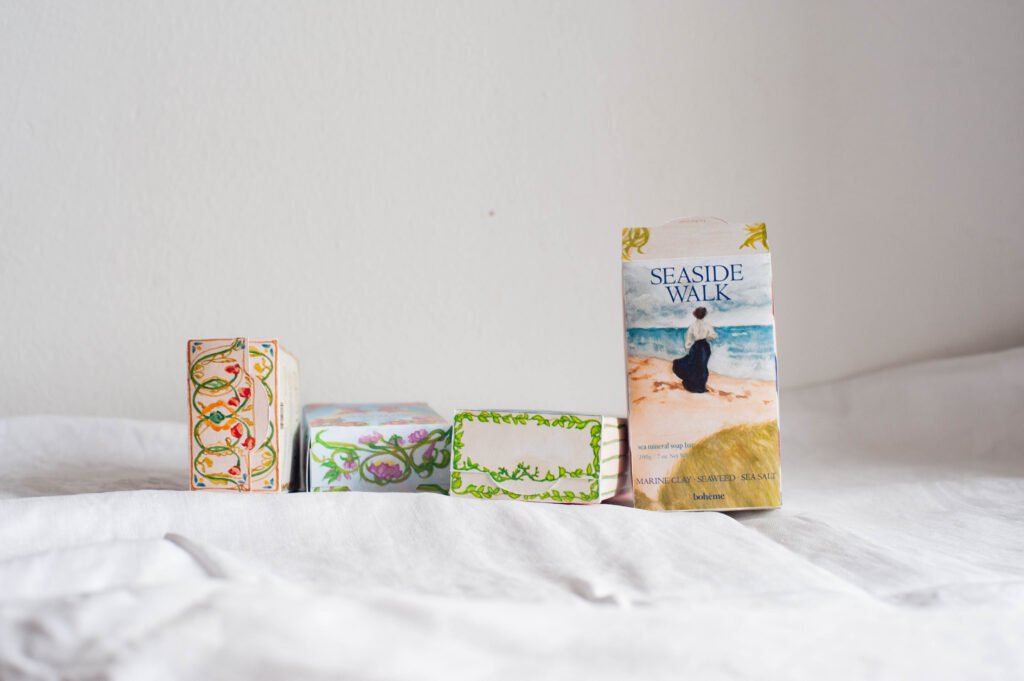
The brand Bohème embraces the idea of free-spirited and eclectic ideas of beauty that a product should be all about nature and feelings one experiences while in it. The unconventionally colourful and maximal design speaks to the spirits breaking the norm of what is in the market while communicating the ideals for the natural beauty products: all about beauty found in nature.

The packaging of Soap Boxes

Meadow House Floral soap bar packaging design photos by studio hyejunahn
Seaside soap box package designed for boheme by studio hyejunahn
laundry day soap box design for boheme by studio hyejunahn

the elements for Brand Aesthetics

branding elements for a mock brand, boheme including logotype, typography and graphic styles.

Boheme’s logotype was made using typography only.  This is to balance out the full-bleed, colourful artwork in the background. Typography is chosen to blend a sense of old-world type and contemporary serif. The style of typography is to convey the feeling of old-time, magical and delicate nature of the beauty product. All together a feeling of seriousness from the authoritative older publications mixed well with mature and elegant air, suitable for introducing a high quality beauty products. 

the mood board for the four soaps

4 sample soap boxes invite you to a story of 4 different landscapes. Each landscape is a result of inspiration and experience coming together to form a specific scene and give viewers sensory immersion and nostalgia. In theory, the soap ingredients would inspire a landscape from where the ingredients of the products were sourced. (i.e. Seaside walk for a kelp or sea salt as an ingredient) old paintings, vintage posters,  fashion and interior design gave visual cues to the stylistic representations.

crafted with hand-drawing

The imagined product’s unique qualities are represented by bespoke artwork. The envisioned landscape images from the mood boards came to life through gouache illustrations.

The learnings

Bold and richly decorative graphics can form a system through similarity and repetition.
There needs to be a balance of bold and simple.
Creativity is an active editing.